Showing posts with label home tours. Show all posts

Wednesday, 15 December 2010

Virtual Vacation: Great Smoky Mountains


Dave and I have elected to spend our Christmas vacation at home again this year, and while I welcome the opportunity to indulge in a bit of a "staycation," I can't help but wish we were sitting around a slightly more festive environment -- like, say, a cozy cabin nestled in the mountains.

Now I'll be the first to admit that I am not, by any stretch of the imagination, a girl who likes to "rough it". To pull a few lines from Troop Beverly Hills (a favorite movie of mine as a kid) [In reference to the Troop "camping out" at the Beverly Hills Hotel]:

Velda: "Is this what you call roughing it?"
Phyllis: "One bathroom for nine people? Yes."

And so, while I may be a fan of the Great Outdoors, I've always preferred to spend my nights in slightly more luxurious surroundings -- and I wouldn't normally consider cabins as qualifying. But in the talented hands of Atlanta designer Suzanne Kasler, this cozy English-style cabin (dubbed Toad Hall) nestled in the heart of the Smoky Mountains in Tennessee manages to be both rustic and luxe. It also happens to be the kind of place I'd love to escape to for the holidays: the perfect spot to cozy up by a big wood burning fire with the hubby, pup and a good book.


I love the warmth that the tapestry, rug and heavy curtains bring to the exposed wood walls and ceiling. The overall feeling is to reminiscent of an English country house, where the cold wood and stone walls and floors are covered with heavy fabrics and tapestries to insulate against the harsh British weather.


Decorating Tip #476: A beautiful Chinoiserie screen works anywhere, even in a log cabin. Perhaps what I love most about this cabin is that there's nary a moose head or stuffed pheasant in sight. Just goes to show you that there's no reason to slavishly adhere to "hunting lodge style" if you want to create a rustic, cabin mood.


Should you decide to invite a large group over to your winter hideaway, there's plenty of space for entertaining in the dining room. Anchoring the large table with two wingback chairs in a buttery yellow brings in a more modern touch, a nice counterbalance to the traditional dining set, candelabra and curtains. While much of the furniture and the walls are dark, plenty of light streams in from the french doors.


I'm fairly certain I'd be parked in front of this fire for much of the day, watching the snow fall outside the window while enjoying the crackle of the fire. Divine.


I love how the kitchen is both rustic and modern. The cabinetry has the look of fine furniture and the lack of upper cabinets gives the kitchen a more refined look that you might find in a dining room. Indeed, the lower cabinets resemble a buffet that just happens to have a gorgeous oven in the center of it.


Of course the master bedroom has a large stone fireplace -- all the better to snuggle up by on a cold winter's night. I love the height of the room as well, but the canopy bed keeps the feel cozy rather than cavernous. The juxtaposition of the floral fabric and the rustic walls and fireplace makes this room perfectly suited for both men and women.


This beautiful canopied bed has me simply dying to dive in it head first. Nothing like a big, fluffy duvet and a roaring fire for sleeping in over the holidays. My only question: where are the side tables and bedside lamps?! As an avid reader in bed, I'm at something of a loss to explain their absence (especially since there's clearly room around the bed for small tables).


Of course though, like any good cabin worth its salt, it's the view outdoors that's the most compelling, the most awe-inspiring. This time of year you might need a space heater and a few blankets to make this porch comfortable, but I'm sure the views across the lake would be well worth it.


Who doesn't love sitting on a rocker on the front porch chewing the fat late into the night?


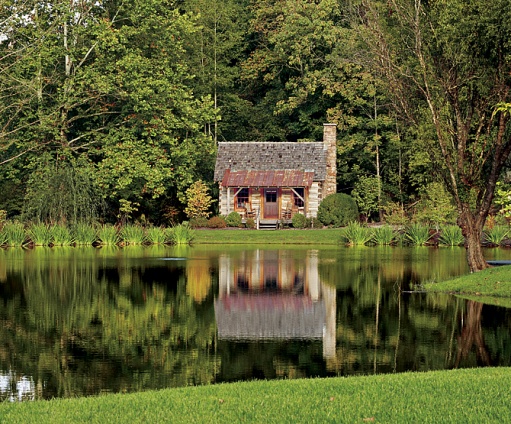
The "Writer's Cottage", another guest house, is nestled between the garden and the woods beyond. I'd imagine it's exactly the sort of place a writer might go looking for some inspiration.


One of the guest houses, adorably dubbed "Tadpole Cottage".

All photographs courtesy of Suzanne Kasler and Architectural Digest.

Thursday, 4 November 2010

Annie Selke's Ranch


This month, House Beautiful wrapped up its series chronicling designer Annie Selke's transformation of a dated ranch into her home. I'm an avid fan of renovation shows, so it's little wonder I thoroughly enjoyed reading about Annie's journey each month (if you haven't been following, you can read all eight installments HERE). What I loved most though was how well Annie was able express her own personal tastes and style while still staying true to the mid century, casual feel of the original home. Ranch homes, when done well, are extraordinarily warm and comfortable -- and this home was certainly done well.

The exterior of the home was repainted a rich chocolate brown, the awkward front porch removed, and new windows were installed. My favorite touch though of course is the pink door, which hints at the sense of whimsy and touches of femininity that Annie brings to mid century style inside.


A recurring element throughout the house is really clever storage, like the floor to ceiling build-ins along the back wall of the dining room. I love the mix of woods here, they create interest and warmth while staying with a relatively modern color palette. I also think it was essential to maintain the lighter blond wood floors throughout the main level, it adds a casualness that you can't achieve with darker stains (and keeps that wall of cabinetry from looking way, way too heavy).


The open u-shaped kitchen has the same sleek cabinetry and hardware of the dining room. All in all, this room is functional, clean and would appeal to a wide range of buyers at resale.


The main living area is bisected into two distinct sitting areas by a two-sided fireplace (this large area was actually once two smaller rooms that Annie combined for an open, great room feel). The two areas though remain connected with the same Dash & Albert indoor-outdoor rugs, a similar color palette and taupe sofas. I love the wall of windows and doors across the back wall -- there's just so much lightness here, the effect of which is only enhanced by the white walls and blond wood.


I love how Annie paired more traditional wingbacks with an iconic mid century piece like the bench (which also keeps the sitting area open to the rest of the house -- I always hate looking into a room and staring at the backs of chairs or sofas!).


The rough-hewn wood coffee table adds an organic element to all the straight 1950s lines. Plenty of throw pillows in fun sherbet colors break up the expanse of taupe linen on the sectional.


The artwork above the stairwell just makes me so happy. The light fixture adds a cool 1950's Sputnik-style touch.


Unlike the main living area of the house, the master bedroom's palette is fairly subdued, though the high doses of glamour courtesy of the large tufted headboard, chandelier and gorgeous triptych of de Gournay wallpaper (that Annie salvaged from the dining room of her last house) keep things interesting. I love the combination of the clean-lined, more modern buffet and chair with the ultra-glam headboard and lighting. It's a great balance that works extraordinarily well in a master bedroom where you're often dealing with two distinct personalities and styles.


Is there anything more appealing in a bathroom than tons and tons of white and gray marble? It's almost a guaranteed home run. The glass mosaic tile on the back wall is a nod to the house's mid century roots and brings in the warmth that's often missing from all-marble baths.


The blond cabinetry is sleekly modern and relates well to the horizontal tile on the opposite wall. And of course, who wouldn't love all that storage?

Annie set out to convert the basement into a welcome retreat for her teenage daughter. I love the exuberance of the colors and patterns -- it's very Missoni to me. The mural was inspired by a detail in a Japanese kimono in the V&A's collection.


The other side of her daughter's room is equally bright and energetic. Annie swapped out standard basement windows for larger ones (and presumably dug out around the foundation to accommodate them) -- though probably not inexpensive, the overall effect is worth it as it eliminates the dark, dank feel of most basements.


Selke had the bathroom tile laid vertically rather than horizontally to make the 8' ceiling in the bathroom feel taller.


The mudroom leading to the garage provides Annie with ample storage for winter clothes and dog accoutrement. Love the striped door leading to the garage.


I've never really thought about decorating a garage (organizing one, yes, but not decorating). This one though is so lively, clean and organized though that I'd be a lot more inclined to spend time in one though (presumably doing all those household projects I keep saying I'll do but have yet to get around to). The striped wall (which Annie did with leftover paint from the rest of the house) reminds me of Alice Supply Co., which carries some truly adorable household items (brooms, dust bins, hoses, etc.) that would work perfectly in Annie's space.

Monday, 9 August 2010

Before & After: Hamptons Home

I'm baaaack. After a much needed week off from blogging, I'm back and feeling much more inspired -- and much more rested. Many thanks for all your sweet comments and e-mails. I can assure you that I'm doing well and there's absolutely nothing to worry about. The past month or so has just been incredibly busy at work and that busyness translated into far less time (and inclination) for blogging.

But let's get down to business, shall we? I thought I'd kick off the week with some great before and after shots of a remodeled Hamptons vacation home that featured in this month's Traditional Home. During the month of August, a privileged few New Yorkers get the luxury of spending weekends vacationing at the Hamptons...and I'll admit that despite having never been to the Hamptons, I can't help but be a little jealous. Not only would I love to be able to escape the (very hot) concrete jungle that is Houston in August generally, but the Hamptons specifically seems like an ideal place to escape to. In my mind at least, the Hamptons seems to capture the best of the northeast with its quaint shingled cottages and villages and its more subtle, more sophisticated (and yet still beachy) sensibility.

And I think that sensibility is beautifully captured in this recent remodel, which was done by Connecticut-based architect Stuart Disston of Austin Patterson Disston Architects and NY-based designer Ken Gemes. I think in many ways the greatest improvements were done to the exterior of the home, where its rather dark and dated 1980s exterior was updated to a brighter, more timeless cottage aesthetic.

The dark, lodge-like mood of the original house extended to the interior, with its floor-to-ceiling stone fireplace and dark beams. The removal of these heavy elements lends an airiness to the space that enhances the room's height. Crisp white paneling adds a touch of sophistication and formality that the original space lacked.

Another view of the living room. I love a simple sisal rug for more casual spaces. The choice of warm yellows and tans is less expected than blue and white and lends a warmth to the room that cooler tones would not provide.

I think the before & after for the foyer is perhaps the most striking of any of the renovations inside the house. The addition of a round table not only highlights the newly expanded size, but also adds a graciousness that the original foyer simply lacked. Note too how much of an impact the flaring of the stairs at the base brings to the room; that one simple change upgrades them from private to public status. The addition of more crisp white paneling adds interest without bringing in additional color.

Of course the kitchen underwent a major overhaul as well. The addition of a boxed beamed ceiling adds additional architectural interest and the awkward dead space between the cabinetry and the ceiling has been eliminated. The green backsplash and orange Roman shade add soft splashes of color in the otherwise neutral space.

The den (formerly the garage) is perhaps my favorite room, with its more relaxed, slightly more contemporary vibe. I love the fabric Gemes selected for the drapery, the grasscloth wallpaper, and the soft, inviting upholstery. That sofa is exactly where I'd be curled up reading when the weather wasn't cooperating and I couldn't be outside.

I think that the dining room is most evocative of the British colonial vibe that the homeowner was striving for with its dark wood, caned-back chairs, sisal rug and tropical-themed art.

Of course I'm charmed by the soft, watery palette of the guest bedroom. The dreaminess is further enhanced with a lovely window seat (which should be a "must" in any vacation home's bedroom). Sure, the colors and prints might be overtly theme-y, but I think you can get away with that in a guest room -- particularly one in a vacation home. After all, when you get to wake up in the Hamptons, don't you want to be reminded of where you are?

Friday, 30 July 2010

To Mr. Drucker, a love letter

Dear Stephen:

When I heard last spring that you were leaving House Beautiful to take over (and make over) Town & Country, I'll admit I was a bit surprised -- and even more skeptical. Wasn't that just a step down? House Beautiful has long been my favorite interiors magazine. I anxiously await its arrival each month and, when it does finally arrive on my doorstep, I read it slowly, savoring every image, every word. Town & Country, on the other hand,...well, it started showing up at my house unannounced a few years ago and every now and then I'll flip through it, but I never would have paid for it.

T&C seemed to target a wealthy, high society, New York-centric audience that struck me as ridiculously dated. The magazine seemed more like an extended advertisement for this narrow lifestyle and rarely included any articles of substance. To be crass, I thought T&C sucked.

But then you came along and breathed new life it. You gave it a clearer voice and more substance. Who would have thought my favorite home of the year would be featured in T&C? I nearly gasped when I saw the feature on Miles Redd's Atlanta chateau. Not only was the home beautiful (and beautifully photographed), but the copy was entertaining and well written as well (yes, I always read the stories!).

So thanks for giving me another magazine to look forward to every month. And keep up the good work.

Sincerely,

Averill at Odi et Amo
* * *

Okay, enough of the mushy, sycophantic stuff. Let's get on with the house ogling, shall we? The reason I love this house so much is because it's so quintessentially Miles (colorful, traditional with lots of chinoiserie touches, plenty of animal print, lots of lacquer), but with a good dose of Southern style and architecture thrown in for good measure.

Check out the gorgeousness that is this atrium. I love the classical architecture paired with the chinoiserie wallpaper and cheeky cheetah slipper chairs. There's something grand and yet playful and even cozy about this room that seems perfectly suited to the young family that lives here.

The living room's slate blue and orange rug really blows me away. What a wonderful color combination! It's bold and current, but also very livable, and I love it paired with the camel-colored furniture in particular. I also love the modern art paired with the more traditional furnishings and architecture.

Another shot of the living room. Isn't that dental molding incredible? I also like that they went for a softer, yellower white for the trim. It creates less of a contrast against the blue than a strong white would and it works beautifully with all the natural light flooding in from the large windows.

The Butler's pantry. Like a powder room, these small, infrequently used spaces are a great opportunity to really experiment and go all out. The ceiling of this space was inspired by the zodiac ceiling of Grand Central Station (my favorite spot in all of NYC, after the NYPL). The bold turquoise continues onto the cabinetry and even the marble. The hits of brass in the fixtures brings a warmth and contrast to all the blue that nickel fixtures never could.

For me the oxblood study very, very Miles. It actually reminds me of a room in my grandmother's house, which was painted out in a similar shade of red and with plenty of gilt (my grandmother loved gilt). The brass trim on the built-ins adds such a sense of luxury -- and lightness to the room.

When you're working with a strong color like this, I think it's best to follow Miles' lead and keep everything as monochromatic as possible. It keeps the room feeling more calm, despite the brilliant red walls. The real interest here comes in the plays of texture and subtle patterns. I'm particularly fond of the pairing of the paisley print sofa, with the ikat pillows. Because the scale of the sofa's print is so much smaller (and more subtle) than the bolder, larger ikat print, it really works beautifully.

What Southern bedroom is complete without monogrammed linens? And what Miles Redd bedroom is complete without wall-to-wall cheetah carpet? [Hint: the answer to both questions is "none".] Of course I love all the soft blues here, the coolness of which are cut by the tans and browns of the walls and carpet. But what I love most is how sumptuously this bed is dressed. The thick duvet, the velvet coronet and bedskirt (all trimmed out in satin). Yummy.

What I wouldn't give some days for my own closet -- let alone my own dressing room! And how soft underfoot must that patchwork pony-skin be. Sure, it's probably not especially practicable, but on a cool morning, fresh out of the shower, how luxurious it must feel on your bare feet. Another great detail here is the tray ceiling, which is wallpapered in a beautiful de Gournay print of trees and birds. I'd take this idea and put it in a bedroom: it'd be like looking up int a forest canopy every night before bed. Very peaceful.

The lady of house enjoys not only her own dressing room, but her own bath, luxuriously appointed in Carrera marble (naturally). Note how Redd painted the bathroom door to mimic the veining of the marble. Isn't that fun? The wallpaper and the fashion drawings are both so wonderfully feminine but the color palette of soft blue and tan ties it all in with the adjoining master bedroom.

If this is the kind of aspirational living that the "new" Town & Country is intent on giving its readers, then I say "yes, please, and more!". After all, who couldn't use a little more fantasy material?

All images courtesy of Town & Country and via The Love List.

Wednesday, 2 June 2010

Aesthetic Oiseau goes to South Carolina


Today our virtual travels take us farther south down the eastern seaboard to St Johns, South Carolina, to a home designed by the incomparable Phoebe Howard. Our tour guide today is Daniela from the DC-based blog Aesthetic Oiseau. If you're looking for inspiration for a modern interpretation of chinoiserie or incredibly stylish chinoiserie finds at a good price, Daniela is your girl. In fact, I found the lantern that now hangs in my master bathroom via Daniela and my husband still remarks what a great buy it was.

* * *

Hi everyone! I'm Daniela from Aesthetic Oiseau, and I'm thrilled to be guest blogging for Averill while she is enjoying some R&R - especially since Odi et Amo is my go-to source for constant interior inspiration! Averill is the queen of showcasing beautiful images - I'm always amazed how she pulls so many together for her posts.

Averill asked us to share images from our favorite vacation homes, and one designer immediately came to mind - Phoebe Howard. Phoebs is the tops in my book and with her home base in Florida, she can design a mean beach house.

There are two particular seaside projects by Mrs. Howard that I adore, but I picked one to show you because I love its vibrant use of color and touches of Chinoiserie...any beach house with turquoise foo dogs works for me!

If only we could all be here:

All images via phoebehoward.net


Don't you love the punch of that dining room? And the overall colors of this house? That periwinkle and kelly green bedroom is one of my all-time favorites.

Hope you've enjoyed one of my favorite vacation spaces by one of my fave designers (and to see the other one that was in the running - click here).

Hope you're having fun Averill!