I'm kicking off this week with another Mood Board Monday courtesy of Sarah at Pewter+Sage. This round, Sarah has asked her readers to create mood boards inspired by one of three summery bedding sets. Now bedding is a great jumping off point for pulling together a bedroom and the three options Sarah proposed were all wonderful examples of that. I chose the Bohemian Medallion duvet from Urban Outfitters (featured above). I love the yellow and charcoal gray color palette and the intricate pattern, which has a lovely, exotic quality that I wanted to further incorporate into my bedroom.
With that as inspiration, I decided to create a warm, summery bedroom that reflected the duvet's more traditional print as well as its thoroughly modern color palette. But I also wanted to imbue the space with a subtle coastal vibe -- if for no better reason that it's summer and we all have vacation on the brain, but also as a challenge to create a coastal interior that does not rely on blue!
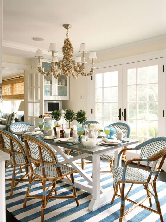
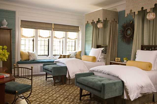
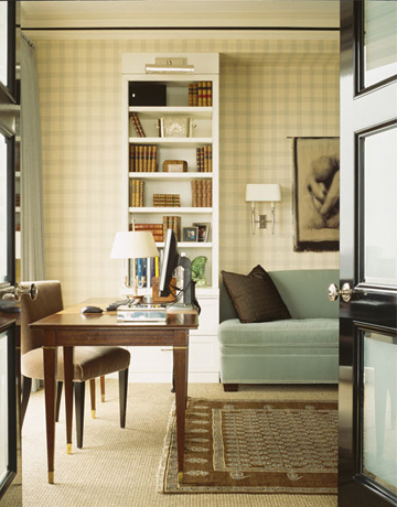
The key to creating a colorful coastal interior that does not rely on watery blues and greens is to bring in a good dose of natural textures (grasscloth, rattan, bamboo, seagrass, etc.) balanced by breezy whites. A few wonderful examples from my favorite designers include:

Robin Bell

John Willey

Phoebe Howard

Amanda Nisbet
Keeping these elements in mind, let's see how I'd go about incorporating this colorful medallion bedding into a bold (yet still soothing) coastal bedroom:

I'd start by painting the room in White Tie from Farrow & Ball, which they describe as "the white of old, pre-brightened, starched cotton" -- and I think that's a brilliant description. It's vintage-y and warm with just a touch of yellow. On the floor, I'd bring in a simple and modern gray and cream rug with a geometric print to ground the room. Curtains in a gray diamond print echo the rug's print without exactly matching it. The yellow slipper chair has a decidedly more feminine twist with its curvy spade print and elegant, spare shape. I'd echo this more feminine shape with a stunning, gray Rococo bed in a modern charcoal gray. The shape also reminds me of a shell, which I'd reference more overtly with a pair of Adler's modern shell lamps (and I love their gray shade). To balance the colorful duvet and shams, I'd stick with white sheets, which will bring in a strong dose of soothing white to the room.
To create more visual space (and keep the focus on that incredible bed), I'd bring in lucite nesting tables for side tables. This modern touch also works as a great foil to the ornate bed and intricate medallion pattern of the bedlinens, while emphasizing the on-trend gray and yellow color palette. To incorporate that textural element so essential for coastal interiors, I'd add a rattan and bamboo woven pendant (whose clean, modern shape is yet another nod to the other modern touches in the room), a grasscloth dresser (with tons of great storage to keep clutter at bay) and a jute pouf (which can perform triple duty as a side table, ottoman or extra seating). Finally, I'd bring in a few pretty and romantic accessories like the antique mercury glass vases (perfectly sized to hold one or two summer blooms) and a pretty lotus candleholder.
Source List:
Clockwise from top left: 1. Bohemian Medallion Duvet from Urban Outfitters. 2. Leran Pendant (24") from IKEA. 3. Shell Lamp from Jonathan Adler. 4. Antique Mercury Wine Bottles from Mothology. 5.Peekaboo Clear Nesting Tables from CB2. 6. 3-piece lotus candleholder from CB2. 7. Coralie Bed from Anthropologie. 8. Surya Fallon Collection FAL01 Gray Rug from Rug USA. 9. Maize Spade cotton fabric and Bark Diamond cotton fabric from Serena & Lily. 10. Avignon Chair from Serena & Lily. 11. Bungalow5 Frances Six-Drawer Dresser in White from Clayton Gray Home. 12. Jute Cube from West Elm. 13. Paint (Shown as background): White Tie from Farrow&Ball.
Be sure to check out all the other great mood boards HERE.