With my newfound obsession with wallpaper now in full swing, I can't help but turn my attention to all the beautiful grasscloths available on the market today. Grasscloth is a great option if you're trying bring warmth, texture and/or character to your home. And, unlike many prints and patterns, it's a timeless choice that will work with you as trends and your tastes inevitably change. The gold standard for grasscloths today is Phillip Jeffries, but Schumacher and Thibaut also offer some lovely options as well. 
If you're looking to keep things neutral, but still want to bring in some subtle pattern and texture, natural grass cloth is an easy choice. Larger, more thickly woven grasscloths lend an exotic, tropical touch to a space and tend to read as more casual and eclectic.
Elle Decor
Many of the interiors featured in this post might best be described as global eclectic or coastal -- but that doesn't mean that grasscloth can't work in streamlined, modern interiors. In fact, finer, more delicately woven grasscloths are a beautiful way to bring some subtle warmth and texture to a room without the heavy texture and overt naturalness of less refined grasscloths.
I love the juxtaposition here of very contemporary, boxy furniture with the suzani blanket and grasscloth paper. I'm a big fan of keeping the big ticket furniture items very clean and modern and adding warmth, color and interest with accessories, rugs and wallcoverings. This also has the benefit of being a fairly inexpensive fix should you want to shake things up a bit -- simply by swapping out the bedding and rug, you could achieve an entirely different look.
Grasscloth is a natural choice for coastal interiors and is a wonderful counterpoint to cooler blue accents. The paper also pairs beautifully with bamboo and other woven blinds (which I'm a big fan of and have had them in both my old house and my new house). The texture here is more like linen than grasscloth, but I love the interest and subtle pattern it brings to this vignette. It's also such an earthy contrast to the lime interiors of the shelves.
I'm actually a big fan when grasscloth is hung with obvious seams, as it brings additional pattern and interest to your walls. In this bedroom, I absolutely love how the faux bois rug playfully picks up on the sophisticated, natural element introduced by the pearly grasscloth. Both are playfully referential, rather than literal.
If you're looking to stay neutral, but want a little bit more drama, why not use a rich mocha or chocolate grasscloth? The end result is incredibly rich. The grasscloth used in this bathroom is actually vinyl, making it much more practical for wet spaces than traditional grasses.
The rich chocolate brown Phillip Jeffries' grasscloth on the walls is made even richer by the blue linen on the ceiling (Phillip Jeffries Sapporo Linen wallpaper in Blue). The milk chocolate colored grass cloth is the perfect counterpoint to the corals, mints and creams in the rest of the space. And I absolutely love the wall-to-wall animal print rug, which adds a nice element of youth and wit to the room (as do the lucite tables) -- it's bold, but in those neutral browns and against the chocolate walls, it reads much quieter.

I love the idea of using grasscloth on a ceiling, which can really make a feature of high ceilings or interesting angles. Here, the dark color helps cozy up the high ceilings, and ties in the dark furnishings with the white walls. If you're looking to make more of a statement though, why not go for a colored grasscloth? While you can paint most grasscloths yourself, these days they also come ready made in a wide array of colors. An obvious choice, I think, would be a rich green: I love this nook, especially the bold black settee with its black and white upholstery. The artwork, matted in white and framed in glossy black frames, help tie the furniture to the walls, creating coherence and harmony.

Chartreuse is an unexpectedly chic color in a cottage bedroom. The all-white furnishings and linens keep it feeling overly trendy while the two fern pillows ground the bed and tie it back to the walls. [If I have learned anything from reading all this design is that, if you want a cohesive look, it's essential to repeat patterns, textures and colors at least once in a space.]

Seriously brilliant with those hot pink drapes. I also like how the green walls don't precisely match the green sofa -- it's this slightly off kilter color story that makes the room look less formal, less "decorated" (and far more livable!).
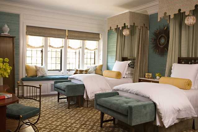
Rich teals and blues can be just as dramatic, and read as more sophisticated: I love the blue-green shade of this grasscloth, which is picked up so perfectly in the velvet benches and cushions. And do I even need to mention the coronets or the gorgeous pendant lights above the two beds? ::sigh::

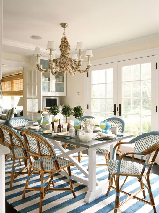
Suzanne Kasler
I gasped when I saw this dining room in the June issue of Traditional Home. It's just so, so beautiful. The subtle color strirations in the blue-gray grasscloth echo the shimmering waters of the lake the house sits on. The silvery-gold ceiling adds even more drama and elegance. Also, how brilliant is the mixing of the loop chairs with the Louis XV chairs? The queen of "keep it pretty" has, once again, done exactly that. Incidentially, I believe that is my dream bed: a spare, architectural canopy paired with a lovely upholstered headboard and footboard.
I absolutely adore wainscotting, but it is true that it can often look rather formal. The addition of the grasscloth above the moldings, however, is a great way to bring some informality to the space as the deep blue grasscloth looks almost as though the walls were upholstered in denim.
Note how the grasscloth here is laid on the vertical rather than the more typical horizontal. These subtle vertical lines add height to a low ceiling and echo the bolder vertical stripes on the sofa. For a more unexpected and thoroughly modern statement, why not try out purple or pink?

A beautiful example of how to really do up a guest bedroom properly. I'm a firm believer in experimenting in these seldom-used rooms. It's a wonderful opportunity to go all out with color, pattern, glamour -- whatever your heart desires. As for me, this room has given me a bad case of purple fever.

{source unknown -- email me if you know!}
I love the bold pink and lime color scheme in this room -- it's so Palm Beach! And also a refreshing change from all the blues and sands that are so typical of coastal interiors (though goodness knows I love my blues!).
And, just like any other wallcovering, grasscloth can be printed with a wide array of patterns, from geometric stripes and fretwork, to ornate damasks and florals.
Love this pretty aqua plaid from Schumacher. The aqua and chocolate brown palette is carried on throughout the rest of the room. I'm particularly fond of that two-toned rug.

Canadian House & Home
Pretty florals in a tone-on-tone pearl are a lovely, girly take on grasscloth. Note how the sofa too is a subtle tone-on-tone pattern, though this time in a more masculine geometric. This subtle tension between the walls and the upholstery create an interesting backdrop for the vivid pops of lime and hot pink.
This Moroccan grasscloth print (in blue!) from Phillip Jeffries has been on my "wish list" for our new home for months now. While I'd love to use it to paper the back wall of our breakfast nook, I know that practicalities dictate I find somewhere else to put it far, far away from the dinner table. And so, until I can think of a more sensible place to use it, I'll have to content myself with fawning over this lovely entryway.
HGTV's Design Star
This guest room, that the contestants decorated for Tiffani-Amber Theissen has got to one of my favorite HGTV rooms ever. The damask print on the grasscloth is gorgeous, and I love how they tempered its bold statement by keeping it on just one wall. My only critique would be to replace the seagrass rug with something else (maybe a bold navy stripe?) as it feels too matchy-matchy with the grasscloth for my taste.
So what about you? Are you as into grasscloth as I am? Have you tried it out in your own home yet or in a design project?